Getting to know your data set through visualization
Skylar Scott, Researcher
June 24, 2020

Photo by un-perfekt from pixabay
Working with real-world data often presents violations and bias that doesn’t exist in data sets from college statistics books. Before beginning any analysis or modeling on a project, I like to get to know the data sets I work with. Most professors of statistics will walk a student through performing tests like Durbin-Watson, Breusch Pagan, and Hausman specification to uncover potential issues in data. These tests hold their value, and can potentially uncover bias or violations you were unaware of. However, a lot can also be uncovered and learned by first exploring the data through visualizations. As long as your research process helps you make the correct decisions on how to choose variables, scale, transform, or drop observations it is a good first step. For me, a visual learner, my first step in data exploration is to visualize a variable using, at minimum, a histogram and scatterplot.
- A histogram of cross-sectional data shows the distribution of the data you are looking at. Real data rarely follows a perfect normal distribution. Bimodality, and skewed distributions are common. Assuming normal distribution, when a different distribution is present may result in conclusion derived from analysis to be over or understated.
Using a histogram with time-series data is also a helpful exercise. By filtering each histogram by the observed year, you can begin to understand how the distribution changes over time, what happens with the number of observations, and the movement of outliers. As I begin to understand these patterns I will often change the bin-size, which can uncover additional information about my data, and help to remove bin bias.
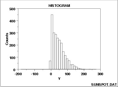
Figure 1: A right skewed distribution - A scatterplot shows the directionality and dispersion of the data. My first step is to compare each regressor against the dependent variable. This can help you begin to decide if a linear or non-linear model is most appropriate. It also can reveal if data is heteroskadstic, or if the variance or error term is unequal. Finally, scatterplots are great for identifying outliers which may change the coefficients in both linear and non-linear models.
Afterword, I like to use a scatterplot of my independent variables against each other. This exercise is similar to performing auxiliary regressions and can reveal multicollinearity and help with a decision to drop a variable from a model.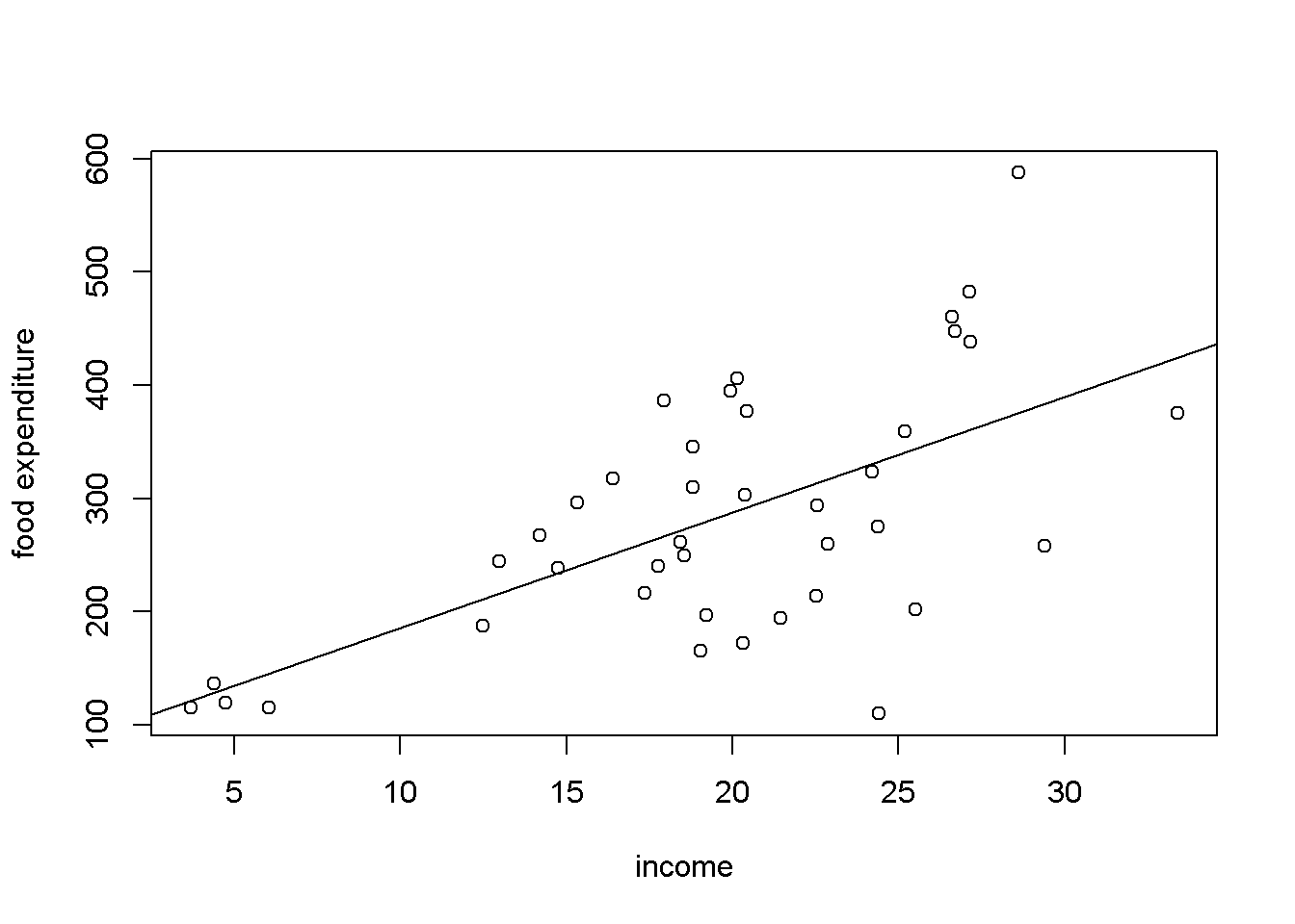
Figure 2: A scatter plot showing heteroskadsticity
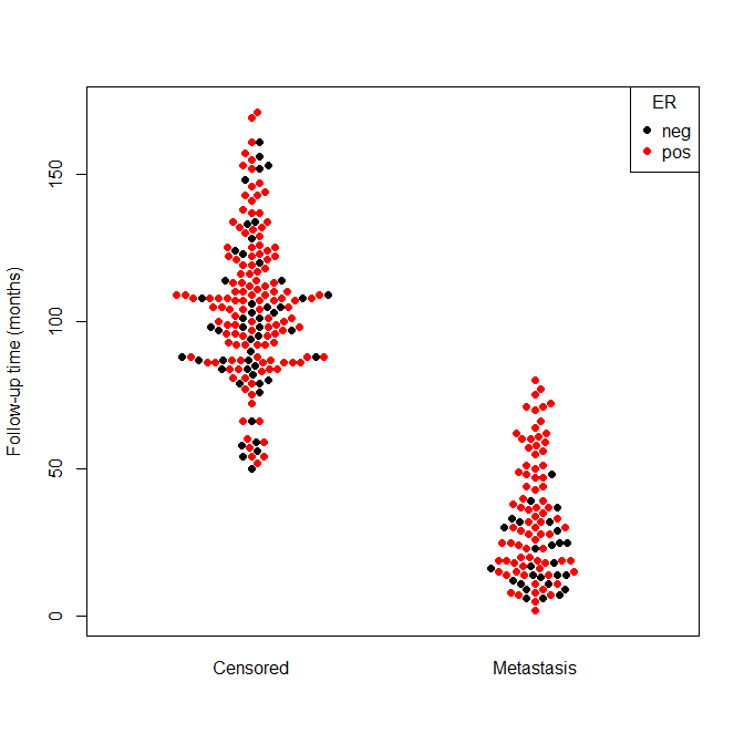
Although these two visualizations are the classic tools for data exploration, they are not the only tools. Researchers can also equip themselves with tools like boxplots which illustrate variance, bee swarm plots which help visualize data when points are very close to each other, or ECDF which helps in understanding a distribution without the bin bias of a histogram.
After data exploration through visualization is performed, diagnostic tests for potential problems in the data should also be performed to confirm “hunches”, and uncover issues that simple visualization cannot. Taking the time to get to know data through visualizations is time well spent. This step has saved me from a lot of potential headaches, and more importantly mistakes, that jumping straight into analysis can cause.