UDRC’s New Style Guide for 2022
Laura Dahl, PhD, UX Researcher
March 9, 2022
Based on user feedback from usability testing in 2021, the UDRC has recently released a new style guide. According to Nielson Norman Group, a front-end style guide is a collection of all design elements for print and digital products. A style guide is a document that a UX professional creates to document a growing and evolving set of design guidelines that arise from the design process.
User experience and visual inconsistencies will arise WITHOUT a style guide, and users will become confused. For example, using mismatched design elements can cause problems with branding and make functional and visual variations act as confusing and nonfunctional aspects for users.
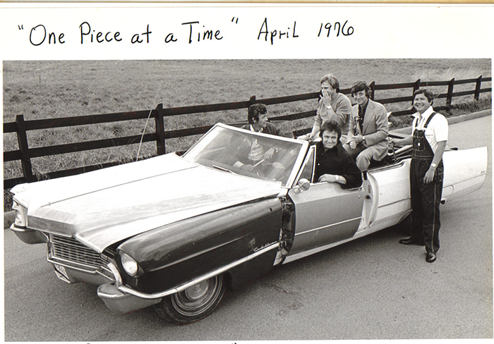
Varying designs of our reports and products would become much like Johnny Cash’s custom Cadillac. In 1976, Johnny Cash released One Piece at a Time. The song tells the story of a Detroit autoworker who spends twenty years collecting Cadillac parts stolen from the assembly line. Unfortunately, when the worker builds his bootleg Cadillac, he finds that many parts are incompatible because key design features have changed over the years.
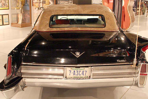
Johnny Cash had the car built with Cadillac car pieces from 1949 through 1954. With some difficulty and a hammer, the car was built. Looking closely at the top image and Figure 1, you will see some abnormalities that make the car not function as originally designed. For example, Cash’s Cadillac has two doors on the driver’s side and one on the passenger’s side. Similarly, two headlights are on the driver’s side and one on the passenger’s side. In addition, the rear tail lights differ on the back of the car, and the right side has a tail fin.
The UDRC team wants to avoid design inconsistencies, so the elements within the style guide include design guidance, code snippets, and color codes that team members can use when working on blog posts or reports. A style guide is a tool meant to be used by the entire team to maintain consistent product designs.
I would now like to explain what I included in the updated style guide. Updated style elements include a more readable font, clarity on photos and icons, graph and Tableau design guidance, and four new color palettes. The following are updates to UDRC’s style guide.
Font and Text Elements
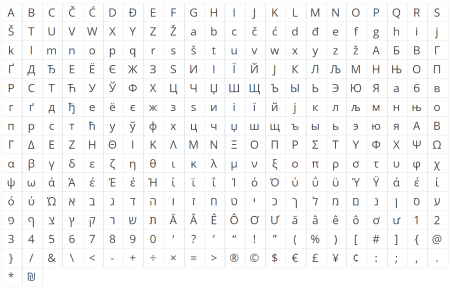
The official font is Open Sans. Open Sans was selected due to feedback from users and a need for a highly readable and accessible font. This font is a clean and modern sans-serif typeface. It was designed explicitly for legibility across print, web, and mobile interfaces. Open Sans is highly readable in small sizes, as on a smartphone, and displayed in huge letter sizes. In addition, Open Sans has multiple glyphs that will allow us to expand accessibility with our reports, as in Figure 2.
For text and headings to be readable, The Web Accessibility Consortium (WebAIM) has created accessibility standards for the contrast between text color and background color. The colors selected here in Figure 3 for text, hyperlinks, callouts, and headings have been checked against a white background for a AAA rating on the WebAIM contrast checker.

Photos and Graphics
Visuals should convey a modern and clean look. People in images should look believable as if they are working on a task, and the photo was taken in Utah, as in Figure 4. Objects in photos should convey information relevant to the page’s content, as in Figure 5. Likewise, graphics should reflect our data-driven approach. Finally, icons should clearly show their meaning and have a label.


Graph and Tableau Designs
Design guidance for graphs and Tableau data visualizations were written for the look and feel, interactions, and text consistency. For example, our Tableau data visualizations must use the web-safe font of Arial because it looks much like Open Sans. In addition, we have guidelines for numbers, titles, tooltips, labels, and explainers.
New Color Palettes
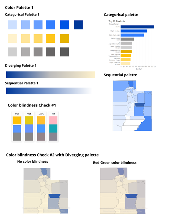
The four new palettes were designed and color blindness tested to create professional color palettes that improve accessibility and help users understand our research results better. I considered several things when designing the new color palettes. For example, people with some degree of color blindness rely on luminance contrast to recognize differences. Luminance contrast is the amount of light reflected from a darker element compared to the amount of light reflected from a second lighter element. Additionally, some colors combined together can be confused as the same color for those with some degree of color blindness. Specifically, do not combine blue and purple, red and green, pink and gray, and purple and pink.
Each palette was tested in two color blindness filters. First, I put each palette in Tableau and tweaked them until maps and graphs looked best through a color-blind filter. Next, I applied these colors to the three palette types: categorical, diverging, and sequential. See the example in Figure 6. A total of four new color palettes were created.
Future updates to the style guide will include a responsive layout or grid systems used to place common UI elements and guidelines for positioning, spacing, and other information.
To see UDRC’s new style guide, you can download it here.
References
Bowers, Micah. Creating a UI Style Guide for Better UX. https://www.toptal.com/designers/ui/ui-styleguide-better-ux
Curtis, Nathan. Definition of a Style Guide. https://twitter.com/nathanacurtis/status/656829204235972608
Fisher, Lindsey. Case of the Mondays: Johnny Cash’s “One Piece at a Time” Cadillac. https://www.streetmusclemag.com/news/case-of-the-mondays-johnny-cashs-one-piece-at-a-time-cadillac/
Labheimer, Page. What Is a Front-End Style Guide? https://www.nngroup.com/articles/front-end-style-guides/