Creating a Tailored Research Presentation
Ari Fenn, PhD, Researcher
April 28, 2022
This blog post will share my recent experience creating tailored research presentations for different audiences and what I learned. Over the past several months, I have presented my research, Area Deprivation and the P20 Pipeline, several times to disparate groups. While the overall presentation structure has remained the same, I ensured that each presentation was tailored for the audience. I think this is a way to ensure the audience is engaged, can relate to the material, and offer specialized insights I otherwise would not have received. Additionally, it shows the audience that you appreciate them taking the time to listen to and engage with your research.
I learned that the easiest way to fit a research presentation for a specific audience is a two-part process. I have always tried to contextualize my research. To do this for a particular audience, I have learned that I should know who my audience is.
Know Your Audience
Understanding your audience is the important first step to tailoring a research presentation. While scheduling the presentation with the non-profit, I specifically asked which areas and outcomes were of particular interest to their group. I found several areas in Salt Lake County, and all of the outcomes fit well with their interests and goals. The second presentation was part of a research event with researchers from state agencies, non-profits, and policy centers, each primarily focused on the whole state.
Knowing an audience also includes understanding familiarity with technical and highly specialized terms. For my presentations, I expected that most participants were unfamiliar with the measure of the independent variable of interest and the geography for which it was calculated. The task of introducing both the measure and the area allowed me to start tailoring each presentation from the beginning.
Contextualize Your Results
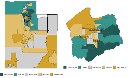
I used an understanding of the interests of each audience to introduce the measure of interest. To do this, I used specific examples for each presentation. In this case, it was by using two distinct maps shown in Figure 1. Both maps conveniently introduced the two unknown terms while focusing on the most familiar areas to each group.
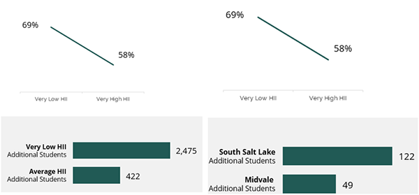
The main research paper has 12 different outcomes, though not all were of interest to each group. In the paper, the outcomes are at the individual level as the dependent variable in a regression. Individual results are often hard to aggregate to a community level for most audiences when discussing outcomes. I then took the areas that I knew were of interest to each group and framed how these differences would look at the community level. These areas are shown in Figure 2. I used two areas for one presentation and showed the differences in expected outcomes. For the other, I used the entire state and showed the expected differences given two levels of the measure of interest.
I have been fortunate to present what I think is relevant and important research to people interested in it. While preparing for these presentations, I have learned that it is important to learn who my audience is so I can tailor my presentations to them. Once I knew which areas and outcomes were most interesting, I chose those to contextualize the results.